Friday, February 24, 2017

022118 S 18x24 Key West Boats, Version 2

As I wrote in my last blog, I had a collector who wanted a boat scene painted in oils.  I did the first version with brushes and the second version, presented here, with palette knives. 
I started with a detailed drawing on a pre-tinted panel that I had made in advance.
Like in the first version, I mixed up the dark values using Cadmium Red Medium and Ultramarine Blue.  The rust red on the bottom of the boats used more Cadmium Red.
I added a touch of Yellow and Cerulean Blue for the backsides and shadow areas of the boats.  The dockside building was made with a mix of mostly reds and yellow with a touch of blue to tone it down.  I started working some of the middle values into the reflections on the water.  The red rust on the bottoms of the boats is worked into the water.
For the lighter, brighter sides of the boats I mixed Cerulean Blue with Titanium White.  For the highlights on the boat roofs and the edges of the boat I use mostly Titanium White with just a touch of red and yellow mixes.  The warmer highlights contrast with the cooler colors of the blues on the boats and in the water and sky. 
The sky colors were mixed with primarily Cerulean and White with the Cad Red and tad of yellow mixing in.  I am always cleaning paint off the palette and mixing it into the next batch of paint which helps create a unified, cohesive painting.  I always mix relatively small batches of paint and use it throughout the painting wherever it is required.
As I painted in the sky, I popped the color into the water as well.  After all, the sky is reflected on the water!  Sometimes the sky crosses over the masts of the boats and then the masts are pulled back in front.
The entire surface is covered and then details are added.  The rigging, the movement of the water, and the various values are all added and adjusted until I am satisfied.
"Key West, Version 2", oil on panel, 18" x 24", c. 2017, by Charlene Marsh.  SOLD

Thanks for following along!

Happy Trails!

Cheers,

Charlene 

P.S.  So which is your favorite between the two?  You can see the first version here.  I have my favorite but I want to hear from you first. 

Thursday, February 23, 2017

021817 S 18x24 Key West Boats, Version 1

I had a collector who had a Key West boat scene that he wanted as an oil painting.  The scene had a great deal of detail and was not a subject matter I normally paint, so I decided to do this painting with brushes.  I ended up doing a second version with palette knives and will detail that painting in my next post.  So, stay tuned!
I started with a detailed drawing on a pre-tinted hardboard panel that I had made.
I mixed dark values using Cadmium Red Medium and Ultramarine Blue.  In fact, these two colors formed the foundation of the palette for this painting.
 
Once I had the dark values in place, I mixed up the medium range values using the same Cadmium Red Medium and Ultramarine Blue.  I also used some Cerulean Blue, Primary Red-Magenta, and Cadmium Red Light. 
 
A sky color was mixed using Cerulean Blue, Ultramarine Blue and Titanium White.  For the slightly darker storm values I added a little Cadmium Red Medium and Cadmium Yellow Light.
As I paint the sky color, I also paint some into the water that reflects the sky.
I continue painting in the sky and water adding in the reflections and movement of the water.  I paint in the rigging and other details.

The finished painting:  "Key West Boats, Version 1", 18" x 24", oil on panel, c. 2017, by Charlene Marsh.

Next post, I will show Version 2 done with palette knives which is my preferred tool for mixing and applying paint.  Should be fun to see the different results!

Thanks for following along! 

Happy Trails!

Charlene

P.S.  I love to hear from you so please leave a comment!   I respond to everyone.

Thursday, February 16, 2017

020417 S 24x36 Late Afternoon in the Forest

This oil painting is inspired by a 12" x 12" plein air painting I did last winter. We have had almost no snow this winter here in southern Indiana so I have not done even one, new, plein air, snow painting!  Anyway, my field notes on the back of this plein air piece reads, "COLD, mid-20 degrees, some sun, thin clouds, 3-6 p.m."  I absolutely love this plein air painting and wanted to work it up into a large painting.  Here's the painting I did on location, a good mile back in the forest, hiking through deep snow:
"Twilight in the Forest, January 21, 2016", plein air oil on panel, 12" x 12", c. 2016, by Charlene Marsh

I edited a photo of the painting in Photoshop to change the dimensions to a rectangular format that would have the same proportions as a 24" x 36" painting.  Here's the "stretched" version I used as a reference when laying out the new painting.
I set up my panel with an "inspiration board" to the right where I have posted some past paintings for reference
  I start with a tinted panel and sketch out the "bones" of the painting using a brush dipped in cold pressed linseed oil and magenta and cerulean blue pigment.
I went back and forth adjusting the hills in the background to get the right height and layers. 
Finally satisfied, I mix a deep black using lots of Ultramarine Blue with Cadmium Red Medium.  Cadmium Red is a very strong, intense color so a little goes a long way.  The creek is like a black ribbon in the snow.
Once I paint in the darkest values, I mix dark blues and violets for the shadow areas in the snow.  I mix the violets with varying combinations of Primary Red-Magenta, Ultramarine Blue, and Cerulean Blue.  I mix small amounts at a time and pop the color in all over the painting.
Knowing I want to go with a golden twilight color in the sky and reflections, I lean the violets more towards red than blue so I can avoid turning the snow green as the painting progresses.  I mix a neutral for the background hills from Magenta, Ultramarine Blue, and a touch of Cadmium Yellow Light.
I mix a delicate golden color for the late afternoon sun warming the sky using lots of Titanium White and a hair touch of Cadmium Yellow Light and Cadmium Red Light and/or Primary Red-Magenta.  I mix the orange, secondary color first and then add tiny amounts of the yellow-orange to white.  The same sky color is added to the black creek for the reflection and to the one hill where the waning sunlight hits.
I mix Cerulean Blue with ample amounts of white for the sky and then gradually mix the sky blue with the salmon twilight to get a wonderful neutral color.  The cerulean blue sky color is  painted at the top of the painting and the neutral mix is used in the middle, transition space. 
Finally, once satisfied with the "muscles" of the painting, I start adding the "skin" with elements and details like the trees, branches, and leaves.
 Branches and trees are added in with lots of frenetic knife work.
The pale salmon leaves from the ash trees that cling all winter are added. 
Tree branches and trunks are pulled forward and then pushed back.  Some of the sky color is added back in, too.  I use both a palette knife and a rubber tipped tool to add the squiggles of branches.  The closest trees and branches are pulled out to sit in front.  I felt like the leaves were taking over and pushed them back by pulling out some trees in the front space of the painting.
And, finally, the finished painting!
"Late Afternoon in the Forest", oil on panel, 24" x 36", c. 2017, by Charlene Marsh.

This painting is finished with a gorgeous, 4" wide, silver, Omega, plein air style frame.  A dark wood, plein air style frame would also look great on the painting.

Thanks for following along! 

Happy Trails!

Charlene

P.S. Be sure to sign up for my e-newsletter, the Art Brush, to learn more about my paintings and how they are created, receive info about paintings in progress, upcoming shows, painting tips, tools, gear, supplies, demonstrations, classes, workshops, reviews, news, and more.  Subscribers will be notified when paintings become available and will receive exclusive, special pricing.
Bonus! When you subscribe, you will immediately receive a FREE one page report on
How to Create Health, Wealth, and Harmony using Fine Art!
Thanks!

Friday, February 3, 2017

012717 S 30x24 Turquoise Creek

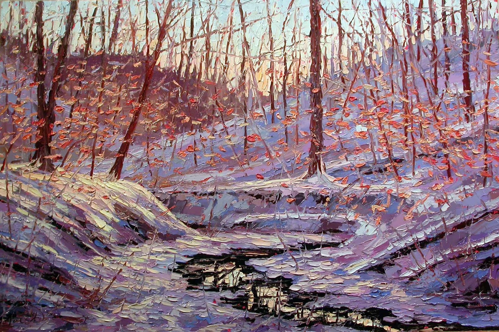
This painting is based mainly on a plein air painting I did this fall with a couple other paintings for inspiration.  I just love this turquoise creek.  The blue shale of the earth with the gold tinted water from the iron oxides turns the color a lovely shade of turquoise.

I start with a magenta tinted panel and sketch out the "lay of the land" with a brush dipped in cold pressed linseed oil and a mix of cerulean blue and magenta pigments.
 
In these photos, the ground tint may appear to have a different shade of red due to the lighting conditions which vary from daylight to nighttime.  Sometimes I have the overhead daylight halogen lights on and sometimes I work under natural light in the studio.  I figure working under a variety of lighting conditions guarantees the finished painting will look good in multiple settings.
I start by painting in the darkest values which in this painting are the edges of the creek and then the rocks, moving to the creek banks.
Green foliage on the banks is added.  While it may be hard to see, I have also started adding the red foliage in the treetops.  I like to work wet into wet so I like the fresh wet paint to work with even though the color may be similar to the ground tint.
You can see here where I have added even more red in deeper values to the treetop foliage as well as a background hill. 
I paint in the dominant trees and keep adding to the overall painting.


I mix small amounts of color at a time and when it runs out, I mix a new color so that there is a wide variety of mixes throughout the painting.
Here I start adding lighter values in the background spaces and darker values in the tree foliage.  

A lovely turquoise is mixed with cerulean blue and cadmium yellow light to block in the water.  Cadmium red medium is added to cerulean mix for the darker areas of the creek and white is added for the light areas.


And, finally, the sky, the lightest value, is added.  Mixed from titanium white and cerulean blue, the sky color picks up some of the red of the foliage when it is applied.  

I have also added distant hills and trees in a light, neutral, red mix.
At this point, the entire surface has been covered and I can step back and study what values, edges, lines, etc. need adjusting.  What is working or not working in the basic skeleton of the painting? 
Next is my favorite part of the painting.  I start to add the flickering leaves, foliage, trees, and branches.  I decide how I want the color of the leaves to gradate across the landscape from top to bottom and foreground to background.  

Details reflected in the water start to appear.
More leaves are added across the entire painting.  Branches are both painted in and scratched into the surface.
Leaves tumble onto the creek and more added over the branches, pushing some back and bringing some forward.
Vertical trees are added and really start to define the space.  Twisting tree branches are added throughout the painting.  Ferns and grasses are added to the creek banks.


The dominant trees are pulled back out from the leaves to bring them forward.  The trees I want to keep in the background I let become buried in the flickering leaves adding to the depth and intrigue of the finished painting. 

More colorful leaves are added to refine and define the finished painting.  The most forward trees are pulled back out at the end.

Highlights on the water are added.


And here is the finished painting.  
  
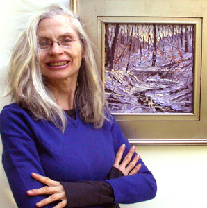
"Turquoise Creek", oil on panel, 30" x 24", c. 2017 by Charlene Marsh.   

Thanks for following along! 

Happy Trails!

Charlene

P.S.  Please sign up for my newsletter, the Art Brush, at
www.CharleneMarsh.com   Subscribers will be notified when the paintings become available and will receive exclusive, special pricing.  The newsletter also has info about paintings in progress, upcoming shows, paintings tips, tools, gear, supplies, classes, workshops, reviews, news, and more!  Thanks!