Showing posts with label marigolds. Show all posts

Tuesday, April 18, 2017

040717 S 24x30 Happy Dancing Flowers, PART TWO

This is PART TWO of a three part blog about the creation of a commissioned oil painting for a couple for their bedroom and shows the creation of the first of two paintings created for them to choose from.  Please visit PART ONE to see the evolution of the foundation of the project and PART THREE to see the second painting created and find out which one Andy and Beth selected. 

Beth and Andy visited the studio/gallery and looked over the paintings I had in stock.  We discussed what they liked and the size of the space.  In particular, Beth loves purple.  Blue-purple is her favorite.  This was a fun challenge to integrate what they liked -- the colors, the waterfall, the flowers -- into a painting to fit their space.

After making some sketches, I started with a drawing on the panel using cold pressed linseed oil and a bit of pigment.


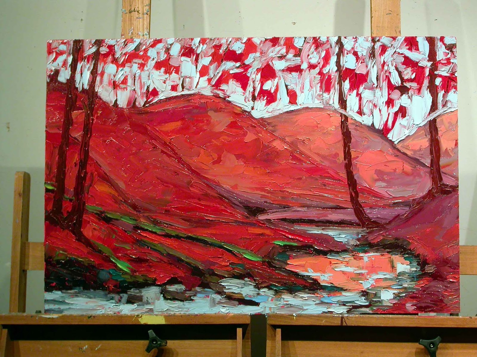
I mix the darkest values using Ultramarine Blue and Cadmium Red Medium.  I put in the dark values wherever I see them on the painting.


For the darker, background trees, I mixed Ultra Blue with a small amount of Cadmium Yellow Light.  I mix up a small batch of color and apply it throughout.  Then i mix up another small batch of color and use that until it is gone.  Some batches I mix in more yellow, some more blue.  Some, I add Cerulean Blue and/or a touch of Titanium White to get a lighter value.


For the brighter greens in the foreground space, I mix up small batches of green the same way but, instead of Ultramarine Blue, use a warmer Cerulean Blue with Cadmium Yellow in varying ratios.  I also would add a touch of Cadmium Red Medium and Primary Red-Magenta to tone it down.


I blocked in the water on the creek using Ultramarine Blue since my clients liked the cobalt color more than a turquoise color.  I also worked in some of the earth tones from the land mixed from predominately Cadmium Red Medium with Ultra Blue and Cadmium Yellow.


Next, I mixed a light blue for the sky using both Ultramarine Blue and Cerulean Blue plus Titanium White and blocked in the sky in the negative space around the trees.  


I then scratched into the surface all over with a rubber tipped implement to create the branches and twigs and sense of movement.


Finally, time to start adding the flowers!  I start with the hollyhocks in the background using various mixes of magenta with a touch of yellow, magenta and white, magenta and ultra blue, magenta and cerulean blue.


More flowers are painted in.  The waterfall in the creek is painted in.  Goldfish are added and then ripples swept over them.  I even go back and add some dark green from the background when I think there may be too many flowers. 


The surface of the painting is alive with the flowers pulsating across the landscape.  Hollyhocks, magic lilies, marigolds, poppies, Queen Anne's Lace are all dancing across the painting.  


The finished painting.  "Happy Dancing Flowers", Code #040717 S 24x30, oil on panel, 24" x 30", c. 2017 by Charlene Marsh.

I ended up painting a second piece to give Beth and Andy a choice.  I also wanted to better integrate what they wanted with the emphasis on purples and violets and blues.  Although I absolutely love the vibrancy and excitement of this painting, I felt like maybe it didn't have enough purple to really meet their expectations.  Also, I just feel better giving clients a choice and then I can add the second piece back into my inventory.  Win win for everyone!  

PART THREE of this blog features the creation of the second painting.  I'll let you know at the end of that blog which painting Andy and Beth selected.  
 
Thanks for following along! 

Happy Trails!

Charlene

P.S.  Be sure to sign up for my newsletter to find out what I share exclusively with fans!  www.CharleneMarsh.com  Thanks!

Monday, April 17, 2017

032417 Commission Project, PART ONE

This is PART ONE of a three part blog about a recent commission project.  PART ONE discusses the evolution and inspiration of the project.  PART TWO covers how the first oil painting was created and PART THREE shows the creation of the second painting.  My clients were then shown both paintings and given a choice of their favorite between the two paintings.  I'll let you know which one they selected in PART THREE so stay tuned.

While visiting the studio/gallery, Andy and Beth looked through the paintings I had in my inventory and picked out various ones they liked.  But they needed a specific size for their bedroom and nothing I had on hand fit what they wanted.  I told them I could paint a painting as a commission project and take into consideration and incorporate exactly what they wanted.

"Poppies and Hollyhocks by the Creek", Code #032416 24x36, oil on panel, 24" x 36", c. 2016 by Charlene Marsh 

Beth really loves purples.  All kinds of purple!  Especially blue-purple.  But she also loves red-violets and blues.  She wanted a flower painting with these colors highlighted.  Pinks and magentas were fine, too.

Beth not only loved the flowers in this painting(above) but the waterfall in it so we wanted to incorporate a waterfall in the final painting for their home.

"Zinnias, Marigolds, & Mums by the Goldfish Pool", Code #091116 12x16, plein air oil on panel, 12" x 16", c. 2016 by Charlene Marsh 

She loved the dark water in the goldfish pool(above) as well as the color of the flowers and the habenero hot pepper plant on the right side although purples had to predominate.

"Lilies by the Goldfish Pool with Glass Bird Bath", Code #070214 12x16, plein air oil on panel, 12" x 16", c. 2014 by Charlene Marsh 

Beth liked the very pale yellow flowers in the lower left of the painting (above) as well as a few poppies.


"Morning Glories", Code #081215 12x12, plein air oil on panel, 12" x 12", c. 2015 by Charlene Marsh  SOLD

After they left the studio, I looked through printouts of past, sold paintings and pulled a few other images that I thought met their criteria and would be good inspiration.  The blue and blue-purple morning glories (above) would be perfect for the painting.  
 
"Purple Ironweed", Code #082316 9x12 no2, plein air oil on panel, 12" x 16", c. 2016 by Charlene Marsh  SOLD

All this purple ironweed(above) definitely fit the bill! 

"Magic Lilies and Hollyhocks", Code #112415 12x12, oil on panel, 12" x 12", c. 2015 by Charlene Marsh  SOLD

I love the Magic Lilies and Hollyhocks in this painting(above) especially vibrating against the green foliage.


So I arranged a couple original paintings to the left of my easel and made a bulletin board of six printouts of past paintings to use for inspiration and reference while working on the commission piece.  You can see the set up in my studio in the photo above.  My palette is on the right side with extra palette knives, paint, and paper towels on the left.

So, with a firm foundation of what my clients want and what direction I want to take the painting, I am ready to get started.  

Please visit PART TWO to see how the first painting in this project was createdPART THREE with the second painting is now up and you can see which painting Andy and Beth selected.

Thanks for following along!

Happy Trails!

Cheers,

Charlene 


Tuesday, December 6, 2016

103116 12x16 Halloween in the Garden

I painted this in the garden, late in the afternoon.  Temps started in the mid to high 60s and got chilly as the sun went down.  I finished this painting in the dark!  The big, gold marigolds were so inspiring.  Zinnias reaching for the sun further back and smaller, orange and scarlet marigolds in the front.  The red, glass sculpture I made from recycled vases was so tall I had to prop it next to a post.  
"Halloween in the Garden, October 31, 2016", plein air oil on panel, 12" x 16", c. Charlene Marsh.

Thanks for stopping in.

Happy Trails!

Charlene 

P.S.  I am getting ready for an Art Launch in the next couple of weeks, exclusively for my subscribers, so be sure to sign up for THE ART BRUSH newsletter where you can receive news, tips, special pricing, exhibitions, and more!  As a bonus, when you subscribe, you will immediately receive a FREE one page report on How to Create Health, Wealth, and Harmony Using Fine Art!

Friday, November 25, 2016

102916 12x16 Zinnias, Marigolds, and Mums By the Goldfish Pool

Here we are the end of October and the zinnias, marigolds, and mums are still blooming like crazy!  High 79 degrees and windy.  Still no frost or freeze. 

I set up with the sun behind my panel so it didn't caste light on the painting while I worked. 
 
With the election just a week away, a neighbor stopped by to talk politics when he spotted me painting in the front yard.  I love talking politics with people who don't take it personal.  I love a spirited discussion!

You can see how the light changed from a warmer green to a cooler dusk light below.  This painting is just bursting with color and joy of the flowers.
 

"Zinnias, Marigold, and Mums by the Goldfish Pool", plein air oil painting on panel, 12" x 16", c. Charlene Marsh.

Thanks for visiting.

Happy Trails!

Charlene 

P.S.  Be sure to sign up for THE ART BRUSH newsletter to get information about my next Art Launch with special pricing and paintings just for my subscribers.  You will also receive news, tips, info about exhibitions, and more!  As a bonus, when you subscribe, you will immediately receive a FREE one page report on How to Create Health, Wealth, and Harmony Using Fine Art!

Monday, November 14, 2016

101116 S 24x36 "Autumn Reflections"

With the colors turning quickly now, I wanted to capture the fall in a 24" x 36" painting.  I set up an "inspiration board" with past paintings that you can see on the right side of the picture.  I started with an initial sketch, the "bones" of the painting,  using the Primary Red Magenta which is a transparent color. 

I start to block in the darkest darks of the painting.  I usually start with the darks and work to the lights.  Much easier to lighten a dark than darken a light!
I start to flesh in the "muscles" or "earth" of the painting.  The distance hills are painted in a more muted, cooler tone. 
The hills that are closer are painted with a more brilliant red. 
I have worked to the lighter colors at this point and blocked in the muted orange of the creek reflection, the flowing water of the creek, and the sky.
For both the sky and the creek, I use Cerulean Blue mixed with Titanium White. I finish blocking in the sky adding some highlights to the creek.
I start adding the trees and tree reflections in the creek.
Branches and leaves are added, working over the entire surface.I continue adding details.
Final touches are added to make sure features in the foreground pop forward and background features sit back.  

Here is the finished painting:
"Autumn Reflections", Code #101116 24x36, oil on panel, 24" x 36", by Charlene Marsh.

Thanks for visiting!  

I love to hear from you so please leave a comment or question!

Happy Trails!

Charlene


P.S.  Be sure to sign up for THE ART BRUSH newsletter where you can receive news, tips, special pricing, exhibitions, and more!  As a bonus, when you subscribe, you will immediately receive a FREE one page report on How to Create Health, Wealth, and Harmony Using Fine Art!
 

Saturday, October 22, 2016

091116 12x16 no2 Zinnias and Marigolds by the Goldfish Pool

This is a plein air oil painting done by the goldfish pool in my front yard.  I made the glass sculpture from recycled glass and it features blue glass with a crystal topper birdbath.  I planted zinnias and marigold seeds early in the summer just so I could paint the flowers by the pool. 


There is also a potted habenaro pepper plant loaded with orange peppers on the right side of the painting.  I have wintered over that habenaro plant for several years now.  Nothing like a year round supply of hot peppers!  I learned my lesson the year I got bit by a copperhead and was laid up for two months.  My garden fell apart and I didn't get any hot peppers to dry and grind.  When I tried to buy organic hot peppers in the winter I discovered they were totally wimpy!!  No fire!

"Zinnias and Marigolds by the Goldfish Pool, September 11, 2016", plein air oil on panel, 12" x 16", c. Charlene Marsh

Thanks for following along!

Happy Trails!

Charlene 

P.S.  Be sure to sign up for THE ART BRUSH newsletter where you can receive news, tips, special pricing, exhibitions, and more!  As a bonus, when you subscribe, you will immediately receive a FREE one page report on How to Create Health, Wealth, and Harmony Using Fine Art!


Sunday, November 29, 2015

Magic Lilies and Hollyhocks 112415 S 12x12

As the days grow shorter and  grayer and the nights grow longer and colder,  I thought it would be nice to paint a cheery, summer, flower scene to remind us of warmer, lighter days that will return.

I start with a sketch made with a brush dipped in a mix of magenta and cerulean blue. 
Then I start by mixing some deep, rich greens, blocking in the darkest darks using a palette knife to both mix the colors and apply the paint.


Then I block in the colors and values over the entire panel.  I block in a goldfish pool in the lower right area and lay out where hollyhocks rise in the back.  Magic lilies appear in the pumpkin patch.


Once I have the basic blocks of shapes and colors I go into the details and fine tuning.  Queen Anne's Lace and marigolds dance across the surface and details added to the overflowing flowers.  I pull out any shapes that need to sit in front of other background shapes.  Here is the finished painting, "Magic Lilies and Hollyhocks", oil on panel, 12" x 12", 112415 S 12x12:  
 

Thanks for checking in and following my artistic journey!

P.S.  If you aren't already signed up for my email newsletter, now would be a great time so you don't miss out on some upcoming specials on new paintings, available only to my email subscribers.   Fill in your email address in the upper right form.  Thanks!

Happy Trails! 

Charlene

Sunday, November 15, 2015

Flowers Galore!

This painting is done in the studio.  I started with several sketches to figure out how I wanted to set it up.  Plein air paintings I have done over the years were used for inspiration.  Here's one page from my sketchbook.
I sketched out the painting on the panel with a brush dipped in linseed oil and a magenta cerulean blue mix and started blocking in the colors.
 I start with the darks first and then block in the bright flowers.
  Continuing to lay in the values and colors.
I work over the entire surface of the panel at the same time. 
 I block in the sky last.  Lightening a dark is much easier than trying to make a light value (with white) dark.  In fact, it is impossible!  Now the fun really begins! 
I go back into the painting adding the details of the flowers and leaves and flowing water.  Again, I work over the entire surface at the same time.  Since I work wet into wet, I have to work as fast as possible and stay with it over several days until it is done. 
 Finished painting.  "Flowers Galore", 24" x 36", oil on panel.  #110615 24x36

Thanks for tuning in!  Happy trails!