Showing posts with label fall painting. Show all posts

Thursday, March 16, 2017

030917 S 24x36 Fall Forest Fantasy, Part 2

This blog is Part 2 that features the execution of a gorgeous fall painting in the studio.  You can see Part 1 HERE where I write about and show the process and influences leading up to the start of this studio painting. 
I do an initial sketch with a brush dipped in oil, picking up a little magenta and cerulean pigment.
I start by fleshing in the darkest dark values mixed with Cadmium Red Medium and Ultramarine Blue.  For the blackest black, I use more Ultra Blue.
I start "carving" in the hills and woods mixed from cadmium red, primary red-magenta, cadmium yellow, and a smaller amount of ultramarine blue and/or cerulean blue.
For the burnt golds in the creek and hillside, I first mix a red-violet from magenta and cerulean or ultra blues.  Then I mix cadmium yellow light with cadmium red light(orange) and/or magenta to get a mostly yellow-orange.  Then I mix a third color with the mostly yellow-orange, pulling in some of the violet. I use the burnt gold in the creek and again in the treeline.
Then white is mixed with some of the violet, with a touch of the yellow-orange, to make a lighter value for the distant space.  I often use complementary color systems in a painting, all of which are mixed from the basic primary colors.  I have a very simple palette with two blues, three reds, one yellow, and Titanium White.
The greens in this painting were mixed with Cadmium Yellow Light and Cerulean Blue with a touch of red or orange to give it the tinge of autumn and cut the brightness of the "summer green".  This makes a nice moss green color on the rocks.
A dark green/rust is popped into the sky area for the canopy of the forest.  A luscious turquoise for the creek is mixed with Cerulean Blue, a touch of Cadmium Yellow Light and Titanium White.  I may also add some Cadmium Red Medium for the parts of the creek with rocks just under the surface of the water.
The sky color is mixed from Cerulean Blue and Titanium White.  I use the lightest value at the horizon line and make it slightly darker with more Cerulean toward the top of the painting.
The light sky color is popped into the creek which is reflecting the sky.  The burnt orange leaves and tree branches are added to the reflections in the creek.
Tree trunks are mixed from Cadmium Red Medium and Ultramarine Blue (leaning more towards the red) and the major trees are added.  The trees really start to define the depth of the space.
In a very loose, organic way, using a rubber tipped implement, I dash in branches, thin tree trunks, and reflections across the entire surface.
Smaller trees are added as well as branches and limbs using the palette knife.
I started adding green and yellow-green leaves on the left side of the painting. 
More leaves are added across the entire painting.  The leaves are mixed to gradate from green to yellow-green to orange-yellow-green to orange and yellow.  The leaves tumble down onto the surface of the creek.
Some of the tree trunks and branches are pulled back out in front of the leaves adding to the dimensional qualities of the painting.  The distance space is tweaked and highlights added to the water.
A few final bright yellows are added in the areas in the foreground and some spots of sky are added back in.

And the final painting:
"Fall Forest Fantasy", Code # 030917 S 24x36, oil on panel, c. 2017, by Charlene Marsh

This painting captures the extraordinary beauty and peace of the deep forest on an autumn day and would be excellent to enhance the Wealth & Abundance energy of the living space as well as the Core Health & Family Relationships and Spiritual Growth energies.  


Here's the link to Part 1 again so you can see the genesis of how the painting evolved.

Thanks for following along!

Cheers,

Charlene 

P.S.  Be sure to sign up for my regular newsletter to receive info about new paintings, special releases, upcoming shows, demos, color and feng shui tips, and more. 

Bonus! When you subscribe, you will immediately receive a FREE one page report on How to Create Health, Wealth, and Harmony using Fine Art!

Tuesday, March 14, 2017

030917 S 24x36 Fall Forest Fantasy, Part 1

I am going to break this blog into two parts.  The first part will cover the seven, plein air, oil paintings that were created on location in the forest over a period of five years and used for inspiration for the finished studio painting.  The second part will focus on the step by step evolution of the studio painting.
In this plein air painting created this past fall on November 1, 2016, http://charlenemarsh.blogspot.com/2016/12/110116-12x16-warm-day-late-fall.html, I particularly love the background hills and trees and colors as well as the sky reflected on the creek and the fallen leaves on the water.  I frequently referred to this painting while working on the background elements and the creek.
In this plein air painting, dated October 22, 2016, http://charlenemarsh.blogspot.com/2016/11/102216-12x16-early-autumn.html, I really liked the creek in the left hand side of the painting.  That golden color, rusty reflections, and smattering of fallen leaves was really enchanting.
The turquoise creek, due to the shale rock, was absolutely gorgeous in this painting.  This plein air painting was done on October 24, 2016, http://charlenemarsh.blogspot.com/2016/11/102416-16x12-turquoise-water.html.
This is another plein air painting, dated November 1, 2013 with the turquoise water which is flowing this time.  Interestingly, this painting was done on the same date as the top one above only three years earlier.  I love to compare the unfolding of the seasons from year to year. 
In this painting dated November 3, 2013, I really like how the color of the leaves changes from green to yellow green to orange-green to oranges and rusts.  These last three paintings are done in one of my favorite spots to paint out in the forest.  I love the composition of the creek receding into the distance.  Last year, several trees fell across the creek in this location, obliterating the view.
This painting dated October 12, 2012 shows the beginnings of the fall colors but is still predominately green.
Just two days later on October 14, 2012, the colors have already changed dramatically.  Some years, fall comes early and some years, like in 2016, it comes quite late.  We did not even get a frost or freeze until mid-November.  I love how the paintings document the unfolding seasons year after year
So I print out photos of all these paintings and mount them on my "inspiration board" that I could refer to as I worked.  Here is my set up, ready to go.  

This is the end of Part 1.  Sometimes setting up the painting and deciding what to do is the biggest part of a project.  Part 2 is available HERE that shows how the painting is executed now that I have determined what I want to do.   

Thanks for following along!  

Happy Trails!

Cheers,

Charlene 

P.S. Be sure to sign up for my email newsletter so you don't miss out on upcoming shows, specials, first look at new work, and more.

Monday, November 14, 2016

101116 S 24x36 "Autumn Reflections"

With the colors turning quickly now, I wanted to capture the fall in a 24" x 36" painting.  I set up an "inspiration board" with past paintings that you can see on the right side of the picture.  I started with an initial sketch, the "bones" of the painting,  using the Primary Red Magenta which is a transparent color. 

I start to block in the darkest darks of the painting.  I usually start with the darks and work to the lights.  Much easier to lighten a dark than darken a light!
I start to flesh in the "muscles" or "earth" of the painting.  The distance hills are painted in a more muted, cooler tone. 
The hills that are closer are painted with a more brilliant red. 
I have worked to the lighter colors at this point and blocked in the muted orange of the creek reflection, the flowing water of the creek, and the sky.
For both the sky and the creek, I use Cerulean Blue mixed with Titanium White. I finish blocking in the sky adding some highlights to the creek.
I start adding the trees and tree reflections in the creek.
Branches and leaves are added, working over the entire surface.I continue adding details.
Final touches are added to make sure features in the foreground pop forward and background features sit back.  

Here is the finished painting:
"Autumn Reflections", Code #101116 24x36, oil on panel, 24" x 36", by Charlene Marsh.

Thanks for visiting!  

I love to hear from you so please leave a comment or question!

Happy Trails!

Charlene


P.S.  Be sure to sign up for THE ART BRUSH newsletter where you can receive news, tips, special pricing, exhibitions, and more!  As a bonus, when you subscribe, you will immediately receive a FREE one page report on How to Create Health, Wealth, and Harmony Using Fine Art!
 

Monday, October 17, 2016

092116 S 24x36 Reflections in the Forest

I just love the colors in this plein air painting, particularly the color of the reflection in the water, and used it as the inspiration for a larger oil painting.
I also set up an "inspiration" board with past plein air paintings to pull from.  You can see the original, framed painting on the left and the "inspiration board" on the right.
I have sketched in the layout for the painting using a paintbrush dipped in cold pressed linseed oil and the transparent pigment, Primary Red Magenta.
I mix a dark earth color using Ultramarine Blue and Cadmium Red Medium, sometimes adding a bit of Cadmium Yellow.
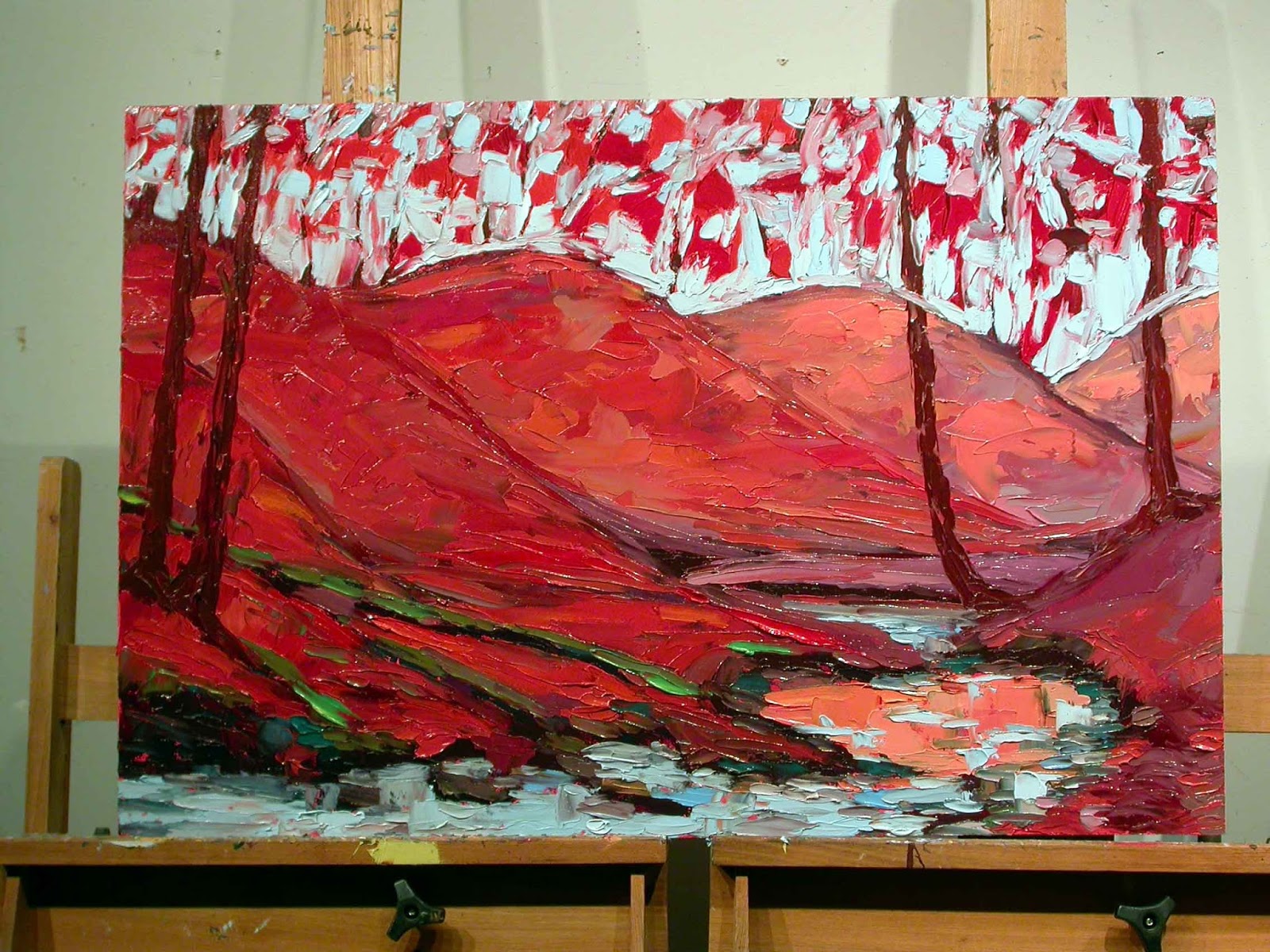
I block in the hills using a mix of Primary Red Magenta, Cadmium Yellow Light, Cadmium Red Medium and Light with a touch of Ultra Blue and/or Cerulean Blue.  I work the entire surface throughout from background to foreground to background again. 
I worked into the night (more than once) on this painting so the light changes from the natural light in the studio to artificial halogen.  So the colors in these photos really shifted. 
I blocked in the golden yellow on the creek with a mix of Cadmium Yellow Light, Primary Red Magenta, and Titanium White with a touch of Cerulean Blue.  For the turquoise color, I mixed the Cerulean Blue with a green mixed from a tad of Cadmium Yellow and Cerulean.  I also often add a touch of Cadmium Red Medium to the Cerulean to get a nice, slate blue color. 
After the "muscles" of the painting are blocked in, I start adding the "skin", with autumn leaves dancing across the surface, reflections in the water, branches and limbs weaving throughout.
And here is the finished oil painting:
"Reflections in the Forest", oil on panel, #092116 S 24x36,  c. 2016, by Charlene Marsh.  SOLD

Thanks for visiting!  

I love to hear from you so please leave a comment or question!

Happy Trails!

Charlene

P.S.  Be sure to sign up for THE ART BRUSH newsletter where you can receive news, tips, special pricing, exhibitions, and more!  As a bonus, when you subscribe, you will immediately receive a FREE one page report on How to Create Health, Wealth, and Harmony Using Fine Art!