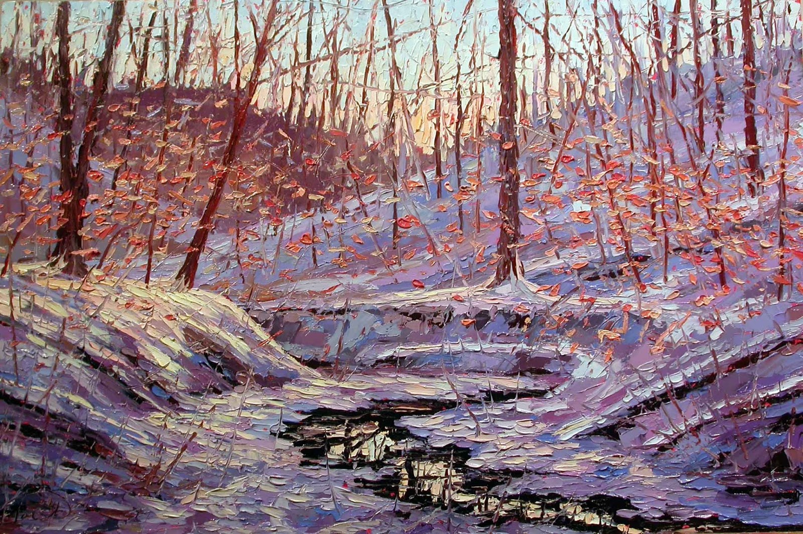
This is one of my very favorite, plein air, snow oil paintings painted late in the afternoon with the sky starting to turn a peachy sunset color. I wanted to work this up into a larger, 24" x 36", painting.
"Twilight in the Forest, February 16, 2014, plein air oil on panel, 12" x 16", c. Charlene Marsh.
So I started with a sketch on a magenta tinted panel.
I mixed up a dark value for the creek water using Ultramarine Blue and Cadmium Red Medium. I also mixed up an orange with the Cadmium Red and Cadmium Yellow Light and then added generous helpings of Ultra Blue.
The same mix of Ultra Blue and Cad. Red, heavy on the Cadmium Red, is used for the treeline on the horizon of the hills. Cerulean Blue and Titanium White, with a touch of Cadmium Red and/or Yellow is mixed for the shadows in the snow. I wanted to keep this palette on the warmer, Cerulean side of blue. I often slide over towards periwinkle and blue-red-violet for the shadows to keep the golden highlights from shifting to green. But for this painting I wanted to keep it in the cyan blue range and use peaches for the highlights.
I often set up the palette for a painting based on a foundation of complementary colors that also make a nice range of ethereal neutrals. Some highlights using the peachy colors are used on the top of the hills. Cooler hilltops use various blues mixed with white.
I continue painting the snow on the hills. The sky color is mixed with two complementary colors. First, Cerulean Blue and Titanium White are mixed for the sky color at the top. A second color is mixed from Cadmium Yellow Light and Cadmium Red Medium and/or Primary Red-Magenta to get a sunny, peachy orange. Generous amounts of White are added to this sunny color and used along the horizon line.
The two colors, blue and peach, are mixed to get the magical, middle color in the sky.
Once the surface is covered, I start adding the trees. The major, big trees are painted in first with my palette knives from a deep brown mixed from Cad. Red, Ultra Blue, and a bit of Cad. Yellow. I use a rubber tipped implement to add twisting and twirling branches and limbs throughout the entire painting. I continue adding trees and branches with the palette knives.
I
also added the delicate, light, salmon colored ash leaves that cling
onto the branches throughout the winter. I work the entire surface,
back and forth from foreground to background, and then back to the
foreground pulling the foremost trees out. I will even go back into the
sky to push back certain areas and pull others forward. Golden orange highlights are added to the foreground of the creek.
And here is the final painting:
"Twilight in the Forest", oil on panel, 24" x 36", Code #031717 S 24x36, c. 2017 by Charlene Marsh.
Thanks for following along!
Happy Trails!
Cheers,
Charlene
This blog is Part 2 that features the execution of a gorgeous fall painting in the studio. You can see Part 1 HERE where I write about and show the process and influences leading up to the start of this studio painting.
I do an initial sketch with a brush dipped in oil, picking up a little magenta and cerulean pigment.
I start by fleshing in the darkest dark values mixed with Cadmium Red Medium and Ultramarine Blue. For the blackest black, I use more Ultra Blue.
I start "carving" in the hills and woods mixed from cadmium red, primary red-magenta, cadmium yellow, and a smaller amount of ultramarine blue and/or cerulean blue.
For the burnt golds in the creek and hillside, I first mix a red-violet from magenta and cerulean or ultra blues. Then I mix cadmium yellow light with cadmium red light(orange) and/or magenta to get a mostly yellow-orange. Then I mix a third color with the mostly yellow-orange, pulling in some of the violet. I use the burnt gold in the creek and again in the treeline.
Then white is mixed with some of the violet, with a touch of the yellow-orange, to make a lighter value for the distant space. I often use complementary color systems in a painting, all of which are mixed from the basic primary colors. I have a very simple palette with two blues, three reds, one yellow, and Titanium White.
The greens in this painting were mixed with Cadmium Yellow Light and Cerulean Blue with a touch of red or orange to give it the tinge of autumn and cut the brightness of the "summer green". This makes a nice moss green color on the rocks.
A dark green/rust is popped into the sky area for the canopy of the forest. A luscious turquoise for the creek is mixed with Cerulean Blue, a touch of Cadmium Yellow Light and Titanium White. I may also add some Cadmium Red Medium for the parts of the creek with rocks just under the surface of the water.
The sky color is mixed from Cerulean Blue and Titanium White. I use the lightest value at the horizon line and make it slightly darker with more Cerulean toward the top of the painting.
The light sky color is popped into the creek which is reflecting the sky. The burnt orange leaves and tree branches are added to the reflections in the creek.
Tree trunks are mixed from Cadmium Red Medium and Ultramarine Blue (leaning more towards the red) and the major trees are added. The trees really start to define the depth of the space.
In a very loose, organic
way, using a rubber tipped implement, I dash in branches, thin tree
trunks, and reflections across the entire surface.
Smaller trees are added as well as branches and limbs using the palette knife.
I started adding green and yellow-green leaves on the left side of the painting.
More leaves are added across the entire painting. The leaves are mixed to gradate from green to yellow-green to orange-yellow-green to orange and yellow. The leaves tumble down onto the surface of the creek.
Some of the tree trunks and branches are pulled back out in front of the leaves adding to the dimensional qualities of the painting. The distance space is tweaked and highlights added to the water.
A few final bright yellows are added in the areas in the foreground and some spots of sky are added back in.
And the final painting:
"Fall Forest Fantasy", Code # 030917 S 24x36, oil on panel, c. 2017, by Charlene Marsh
This painting captures the extraordinary beauty and peace of the deep forest on an autumn day and would be excellent to enhance the Wealth & Abundance energy of the living space as well as the Core Health & Family Relationships and Spiritual Growth energies.
Here's the link to Part 1 again so you can see the genesis of how the painting evolved.
Thanks for following along!
Cheers,
Charlene
P.S. Be sure to sign up for my regular newsletter to receive info about new paintings, special releases, upcoming shows, demos, color and feng shui tips, and more.
Bonus!
When you subscribe, you will immediately receive a FREE one page report on How to Create Health, Wealth, and Harmony
using Fine Art!
I am going to break this blog into two parts. The first part will cover the seven, plein air, oil paintings that were created on location in the forest over a period of five years and used for inspiration for the finished studio painting. The second part will focus on the step by step evolution of the studio painting.
In this plein air painting created this past fall on November 1, 2016, http://charlenemarsh.blogspot.com/2016/12/110116-12x16-warm-day-late-fall.html, I particularly love the background hills and trees and colors as well as the sky reflected on the creek and the fallen leaves on the water. I frequently referred to this painting while working on the background elements and the creek.
In this plein air painting, dated October 22, 2016, http://charlenemarsh.blogspot.com/2016/11/102216-12x16-early-autumn.html, I really liked the creek in the left hand side of the painting. That golden color, rusty reflections, and smattering of fallen leaves was really enchanting.
The turquoise creek, due to the shale rock, was absolutely gorgeous in this painting. This plein air painting was done on October 24, 2016, http://charlenemarsh.blogspot.com/2016/11/102416-16x12-turquoise-water.html.
This is another plein air painting, dated November 1, 2013 with the turquoise water which is flowing this time. Interestingly, this painting was done on the same date as the top one above only three years earlier. I love to compare the unfolding of the seasons from year to year.
In this painting dated November 3, 2013, I really like how the color of the leaves changes from green to yellow green to orange-green to oranges and rusts. These last three paintings are done in one of my favorite spots to paint out in the forest. I love the composition of the creek receding into the distance. Last year, several trees fell across the creek in this location, obliterating the view.
This painting dated October 12, 2012 shows the beginnings of the fall colors but is still predominately green.
Just two days later on October 14, 2012, the colors have already changed dramatically. Some years, fall comes early and some years, like in 2016, it comes quite late. We did not even get a frost or freeze until mid-November. I love how the paintings document the unfolding seasons year after year.
So I print out photos of all these paintings and mount them on my "inspiration board" that I could refer to as I worked. Here is my set up, ready to go.
This is the end of Part 1. Sometimes setting up the painting and deciding what to do is the biggest part of a project. Part 2 is available HERE that shows how the painting is executed now that I have determined what I want to do.
Thanks for following along!
Happy Trails!
Cheers,
Charlene
P.S. Be sure to sign up for my email newsletter so you don't miss out on upcoming shows, specials, first look at new work, and more.
This oil painting is inspired by a 12" x 12" plein air painting I did last winter. We have had almost no snow this winter here in southern Indiana so I have not done even one, new, plein air, snow painting! Anyway, my field notes on the back of this plein air piece reads, "COLD, mid-20 degrees, some sun, thin clouds, 3-6 p.m." I absolutely love this plein air painting and wanted to work it up into a large painting. Here's the painting I did on location, a good mile back in the forest, hiking through deep snow:
"Twilight in the Forest, January 21, 2016", plein air oil on panel, 12" x 12", c. 2016, by Charlene Marsh
I edited a photo of the painting in Photoshop to change the dimensions to a rectangular format that would have the same proportions as a 24" x 36" painting. Here's the "stretched" version I used as a reference when laying out the new painting.
I set up my panel with an "inspiration board" to the right where I have posted some past paintings for reference.
I start with a tinted panel and sketch out the "bones" of the painting using a brush dipped in cold pressed linseed oil and magenta and cerulean blue pigment.
I went back and forth adjusting the hills in the background to get the right height and layers.
Finally satisfied, I mix a deep black using lots of Ultramarine Blue with Cadmium Red Medium. Cadmium Red is a very strong, intense color so a little goes a long way. The creek is like a black ribbon in the snow.
Once I paint in the darkest values, I mix dark blues and violets for the shadow areas in the snow. I mix the violets with varying combinations of Primary Red-Magenta, Ultramarine Blue, and Cerulean Blue. I mix small amounts at a time and pop the color in all over the painting.
Knowing I want to go with a golden twilight color in the sky and reflections, I lean the violets more towards red than blue so I can avoid turning the snow green as the painting progresses. I mix a neutral for the background hills from Magenta, Ultramarine Blue, and a touch of Cadmium Yellow Light.
I mix a delicate golden color for the late afternoon sun warming the sky using lots of Titanium White and a hair touch of Cadmium Yellow Light and Cadmium Red Light and/or Primary Red-Magenta. I mix the orange, secondary color first and then add tiny amounts of the yellow-orange to white. The same sky color is added to the black creek for the reflection and to the one hill where the waning sunlight hits.
I mix Cerulean Blue with ample amounts of white for the sky and then gradually mix the sky blue with the salmon twilight to get a wonderful neutral color. The cerulean blue sky color is painted at the top of the painting and the neutral mix is used in the middle, transition space.
Finally, once satisfied with the "muscles" of the painting, I start adding the "skin" with elements and details like the trees, branches, and leaves.
Branches and trees are added in with lots of frenetic knife work.
The pale salmon leaves from the ash trees that cling all winter are added.
Tree branches and trunks are pulled forward and then pushed back. Some of the sky color is added back in, too. I use both a palette knife and a rubber tipped tool to add the squiggles of branches. The closest trees and branches are pulled out to sit in front. I felt like the leaves were taking over and pushed them back by pulling out some trees in the front space of the painting.
And, finally, the finished painting!
"Late Afternoon in the Forest", oil on panel, 24" x 36", c. 2017, by Charlene Marsh.
This painting is finished with a gorgeous, 4" wide, silver, Omega, plein air style frame. A dark wood, plein air style frame would also look great on the painting.
Thanks for following along!
Happy Trails!
Charlene
P.S. Be sure to sign up for my e-newsletter, the Art Brush, to learn more about my paintings and how they are
created, receive info about paintings in progress, upcoming shows, painting
tips, tools, gear, supplies, demonstrations, classes, workshops, reviews, news, and more. Subscribers will be notified when paintings become
available and will receive exclusive, special pricing.
Bonus!
When you subscribe, you will immediately receive a FREE one page report on
How to Create Health, Wealth, and Harmony
using Fine Art!
Thanks!