Tuesday, May 9, 2017

Frankie Doggie Portrait vs 2 111515 S 12x12

This is the second painting of my dog, Frankie, who was a three legged rescue from our local Brown County Humane Society.  You can see the first painting and how it was created HERE as well as some more info about Frankie.


This is the photo I used for the painting.  He looks so happy with a big smile on his face!
I started with a quick sketch and then blocked in the blacks and rusts on his head and face.
I used purples for the shadows to work with the complementary color, yellow, used in the whites of his fur.  I added his bright, hunter orange collar, bright pink tongue, and sparkling eyes that capture his sweet, gentle personality and happy demeanor.
"Happy Dog Frankie, version 2", oil on panel, 12" x 12", c. Charlene Marsh, Code #111515 S 12x12.

Thanks for following along.  Happy Trails!

Cheers,

Charlene

Monday, May 8, 2017

Happy Dog Frankie! 111015 S 12x12

This is something different for me.  I decided to paint some pet portraits and start with my own rescue dog, Frankie.  I got him from the local Brown County Humane Society which is a wonderful "no kill" shelter that does a lot with very little.  They have reduced the overpopulation of dogs and cats in our rural county so successfully(still more to do!), with innovative programs, that the leaders are often asked to address groups nationally.  

I adopted Frankie in 2007 as, maybe, a two or three year old.  He had shown up at a local camp with a broken leg that had never been properly set.  In the end, after consulting several vets, the consensus was that the leg had to go.  So I met Frankie when he was still recovering from the surgery.  I saw a picture of him in the newspaper and his big brown eyes just melted my heart.  And the rest is history.

I just built a ramp for him this week to get up onto the deck and into the house.  He seemed to be having more and more trouble navigating the two steps to the deck as he gets older.  Hoping the ramp works for him!
So, anyway, I started this portrait by taking some pictures of Frankie and found he was an easy model, with a big smile on his face most of the time.  I did an initial sketch and then blocked in the colors.  I'm afraid I didn't get any "progress" shots beyond the initial sketch because I painted this at night and the lights in my studio, being daylight halogens, tend to cast the photos yellow.  
So here is the side by side with the painting and the photo and, below, the finished painting.
"Frankie", oil on panel, 12" x 12", Code# 111015 S 12x12, c. 2015 by Charlene Marsh.

I did a second painting of Frankie I will share next time.  Let me know which one you like best.

Happy Trails!

Cheers,

Charlene 

Sunday, May 7, 2017

Teddie 010516 12x12

I have started a new series of animal paintings that I plan to unveil at a fundraiser for our local Brown County Humane Society Dawg Gone Walk and Fiesta, May 21, 2017, 1:00-3:30 p.m., where I will have a sponsorship booth.  I am really looking forward to this fun event to help raise money for this wonderful shelter that has a 98% "out alive rate".  They do a spectacular job, especially for a rural shelter in a small community.  Some of the volunteers have even given lectures to national audiences about their innovative and effective programs.

Here is a sneak peek of one of the animal portraits.  This is a painting of my beloved dog, Teddie, who passed away March 2, 2015 at the age of sixteen and left a big hole in my heart. 
 
He insisted on going on our two mile, daily hike in the forest every day up to the very last week or so.  The last couple of years he walked slower and slower and slower.  One evening, at the end of the trail, I got to the back of my property and waited for him at the gate.  And waited and waited and waited.  By then it was quite dark so I got a flashlight and then re-traced the entire trail looking for him.  I couldn't find him.  

In a near panic, I walked back towards home and asked my other dog, Kendra, "Where's Teddie?  Find Teddie."  About halfway back home, she stopped along the trail and stared down towards the creek.  I flashed my light in that direction and saw Teddie had dropped down to the creek to follow it to our back hill.  I think he was having a hard time seeing the trail after it got dark.  A sense of relief washed over me.  Boy, was I happy to see him!

After that incident, I would stop at various points on the trail and wait for him to catch up.  I never let him out of sight for very long.  I can usually walk the two miles in forty five minutes at a relaxed pace(less if I am in a hurry) but, as Teddie got older and older, I eventually had to budget 1 1/2 hours for our walk.  

Sometimes he would be asleep at walk time and I couldn't rouse him to go so I would take off without him.  I only left him behind once or twice because when I got back home, he would be fully awake and mad as a hornet at me for leaving him behind. 

So for this painting of Teddie, I started by selecting a reference photo that I shot some years ago that captures the spirit of my boy with his fluffy, Benji type fur.  Then I roughed in a loose sketch with alizarin and cerulean paint mixed with oil.  I used a paint brush to paint in the sketch.


I switch to my favorite palette knives and start blocking in the shadows on the body and ground and the darkest parts of the nose, mouth, and eye.
I continue to work the background using a combination of light spring greens and a gray violet.  I finish blocking in the fur on the body and face. I soften the line where his back end meets the background so that it recedes in the distance.
Now that the basic "under fur" has been painted in, I go back on top with the lighter wisps and strands of his fuzzy fur.  I work from the back of his body to the front so the front fur sits on top of the back fur.
The fur on his head often stuck straight up, wisped up with static electricity more than the picture shows so I painted how I remembered him.  In the end, I felt like I captured Teddie's spirit and felt like he was here with me as I finished the painting.
Here's the final painting under natural light where the colors are more accurate than the photos of the painting in progress shot indoors under artificial light.
"Teddie", oil on panel, 12" x 12", Code #010516 S 12x12

Thanks for following along!

Happy Trails!

Cheers,

Charlene

Thursday, April 27, 2017

Four Bridges Art Festival, Chattanooga, TN, April 21-23, 2017

This year I was fortunate enough to jury into the 4 Bridges Art Festival in Chattanooga, Tennessee in the stunningly gorgeous Lookout Valley.  The show, held at the First Tennessee Pavilion, started with an evening Preview opening on Friday, April 21, 2017 and continued all day Saturday, April 22, and Sunday, April 22, 2017.  

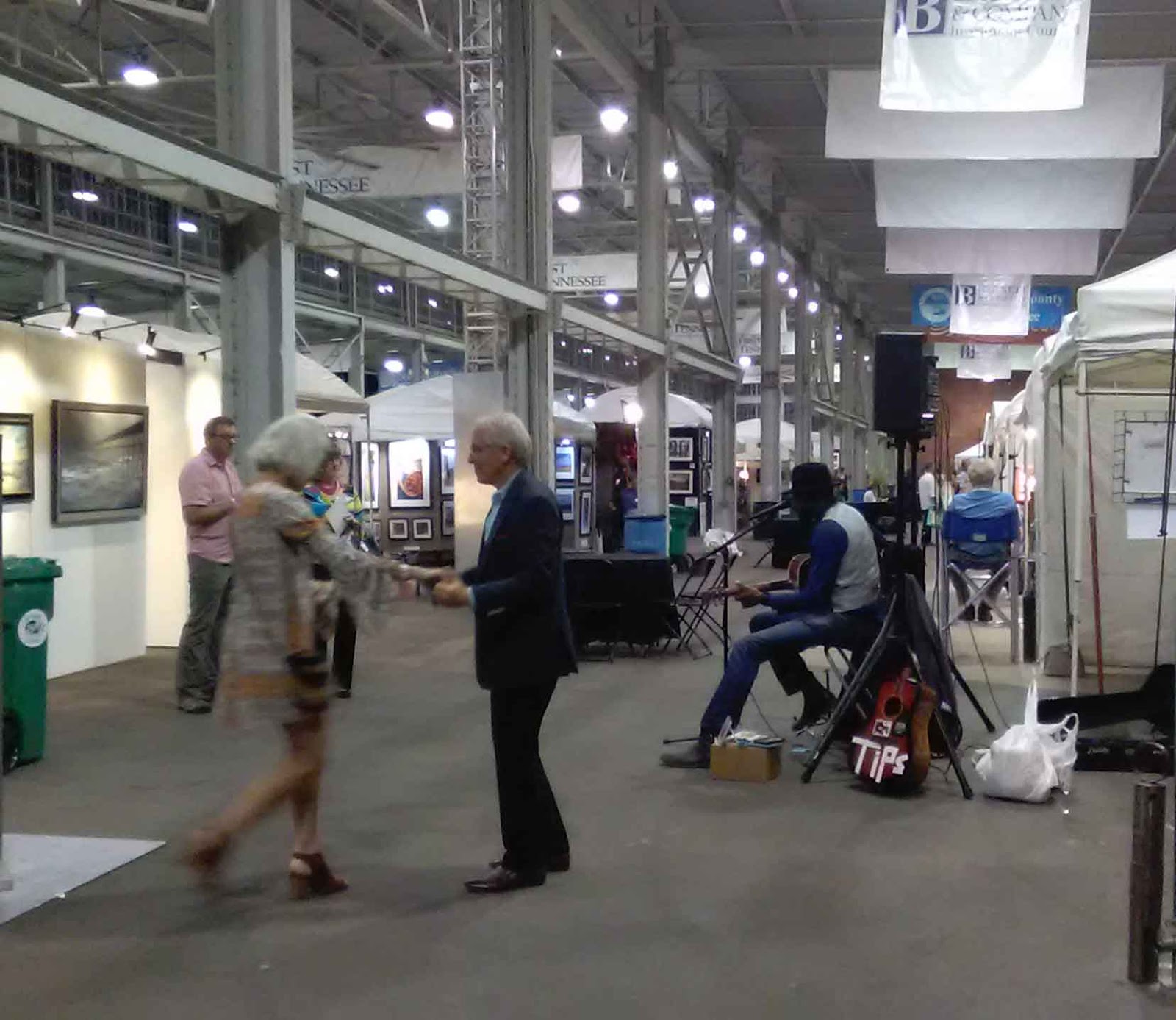
This picture is from the evening preview where they had tables loaded with all kinds of flavors of chocolate truffles with names like "Bittersweet", "Champagne", "Brie de Pear".  You can see by the empty trays near the end of the evening that the truffles were very popular.
Drinks and hors d'oeuvres were served to the happy, lively crowd. Lots of fabulous art and artists. 
A jazz/blues musician played to the crowd and one couple decided to swing dance to the music.
Luckily, we were under cover in the First Tennessee Pavilion because steady rain and chilly wind gusts would have completely washed out the show if we had been outside.  The key word for Sunday was "monsoon".  You can see in this photo above, taken at 3 p.m. Saturday, that the only people in the aisles were artists playing on their devices.  

Even so, there were a few serious collectors who turned out for the show.  This was my first time exhibiting but others, both artists and patrons, told me that usually the venue is shoulder to shoulder with the crowd jostled along where it can be hard to see the art.  One buyer was thrilled that there were fewer people in attendance and she could actually see the artwork.

All and all, a lovely show with friendly, gracious people.   Chattanooga is a small city on the move with many people I talked to having only arrived in the last year or two.  Many credit the new Tennessee Aquarium built 10-12 years ago with revitalizing and turning the city around.  

Thanks for following along.

Happy Trails!

Cheers,

Charlene 

Wednesday, April 19, 2017

041017 S 24x30 Morning Glories, Hollyhocks, and Poppies by the Creek, PART THREE

This is PART THREE of a three part blog about the creations for a recent commission project.  This is the second of two paintings I created for the projectYou can see the design process in the PART ONE blog. You can see the first painting HERE in PART TWO 

To summarize, Beth and Andy wanted a flower scene with lots of purple:  blue-purples, red-violets, blues.  The water needed to be a darker cobalt blue, not a turquoise or cerulean blue.  They liked certain elements in various paintings that they saw in my studio/gallery during a visit.  So I took notes and then pulled out the paintings and/or printouts of what they liked.  


I started with a sketch that includes writing out what I what where and what colors and flowers I want to emphasize.


Then I sketch out the idea on a prepared panel using a brush dipped in cold pressed linseed oil and magenta mixed with cerulean blue pigment.  


I mix up a dark value using Cadmium Red Medium and Ultramarine Blue and use that on the edges of the creek.  I mix up a dark green for the background trees using Ultra Blue, Cadmium Yellow Light, and a touch of Cad. Red Med. and/or Primary Red-Magenta.  


I use Ultramarine Blue with a touch of Titanium White for the water in the creek. I also add in some dark, rusty ochers in the water where the earth and rocks underneath color the water. I start painting in the morning glories with dark purples mixed from various combinations of Ultra. Blue or Cerulean Blue with Magenta gradually adding lighter values mixed with white. 


The green foliage in the middle ground space is mixed using primarily Cerulean Blue(a warmer blue than Ultramarine) and Cadmium Yellow Light.  More blue is used in the background greens to help the space recede.  Magenta and Cadmium Red are also mixed in sparingly for shadows and dips in the topography.


More dark background foliage in the trees is added.  Leaves are added to the Morning Glories.


The sky, mixed with Cerulean Blue and Titanium White, is popped in the negative space around the trees.


Bright zinnias are added to the background, dancing across the trees.  The zinnias are mixed from various combinations of magenta, cadmium red, yellow, and blue.  Bright poppies from pure Cadmium Red Medium and Light are added to their complementary color, green.  Using complementary colors next to each other cause them to vibrate optically and create visual excitement.


More flowers are added throughout the painting.  A pale violet color is mixed using lots white with purple.  Yellow is used sparingly.  Hollyhocks are painted in.  Goldfish are added to the creek and a waterfall is painted in.  Final details are added to the foreground flowers.  And the final painting(below):


"Morning Glories, Hollyhocks, and Poppies by the Creek", Code #031017 24x30, oil on panel, 24" x 30", c. 2017, by Charlene Marsh. SOLD

And so which painting did Andy and Beth select?  While they loved both paintings, they selected this one, the second one!  I thought they might because it made the purples and blue-purples the stars of the painting more than the first one(which is fabulous in it's own right).
 

You can see the design process in PART ONE and the creation of the first painting in PART TWO.  

Thanks for following along.

Happy Trails!

Cheers,

Charlene


Tuesday, April 18, 2017

040717 S 24x30 Happy Dancing Flowers, PART TWO

This is PART TWO of a three part blog about the creation of a commissioned oil painting for a couple for their bedroom and shows the creation of the first of two paintings created for them to choose from.  Please visit PART ONE to see the evolution of the foundation of the project and PART THREE to see the second painting created and find out which one Andy and Beth selected. 

Beth and Andy visited the studio/gallery and looked over the paintings I had in stock.  We discussed what they liked and the size of the space.  In particular, Beth loves purple.  Blue-purple is her favorite.  This was a fun challenge to integrate what they liked -- the colors, the waterfall, the flowers -- into a painting to fit their space.

After making some sketches, I started with a drawing on the panel using cold pressed linseed oil and a bit of pigment.


I mix the darkest values using Ultramarine Blue and Cadmium Red Medium.  I put in the dark values wherever I see them on the painting.


For the darker, background trees, I mixed Ultra Blue with a small amount of Cadmium Yellow Light.  I mix up a small batch of color and apply it throughout.  Then i mix up another small batch of color and use that until it is gone.  Some batches I mix in more yellow, some more blue.  Some, I add Cerulean Blue and/or a touch of Titanium White to get a lighter value.


For the brighter greens in the foreground space, I mix up small batches of green the same way but, instead of Ultramarine Blue, use a warmer Cerulean Blue with Cadmium Yellow in varying ratios.  I also would add a touch of Cadmium Red Medium and Primary Red-Magenta to tone it down.


I blocked in the water on the creek using Ultramarine Blue since my clients liked the cobalt color more than a turquoise color.  I also worked in some of the earth tones from the land mixed from predominately Cadmium Red Medium with Ultra Blue and Cadmium Yellow.


Next, I mixed a light blue for the sky using both Ultramarine Blue and Cerulean Blue plus Titanium White and blocked in the sky in the negative space around the trees.  


I then scratched into the surface all over with a rubber tipped implement to create the branches and twigs and sense of movement.


Finally, time to start adding the flowers!  I start with the hollyhocks in the background using various mixes of magenta with a touch of yellow, magenta and white, magenta and ultra blue, magenta and cerulean blue.


More flowers are painted in.  The waterfall in the creek is painted in.  Goldfish are added and then ripples swept over them.  I even go back and add some dark green from the background when I think there may be too many flowers. 


The surface of the painting is alive with the flowers pulsating across the landscape.  Hollyhocks, magic lilies, marigolds, poppies, Queen Anne's Lace are all dancing across the painting.  


The finished painting.  "Happy Dancing Flowers", Code #040717 S 24x30, oil on panel, 24" x 30", c. 2017 by Charlene Marsh.

I ended up painting a second piece to give Beth and Andy a choice.  I also wanted to better integrate what they wanted with the emphasis on purples and violets and blues.  Although I absolutely love the vibrancy and excitement of this painting, I felt like maybe it didn't have enough purple to really meet their expectations.  Also, I just feel better giving clients a choice and then I can add the second piece back into my inventory.  Win win for everyone!  

PART THREE of this blog features the creation of the second painting.  I'll let you know at the end of that blog which painting Andy and Beth selected.  
 
Thanks for following along! 

Happy Trails!

Charlene

P.S.  Be sure to sign up for my newsletter to find out what I share exclusively with fans!  www.CharleneMarsh.com  Thanks!

Monday, April 17, 2017

032417 Commission Project, PART ONE

This is PART ONE of a three part blog about a recent commission project.  PART ONE discusses the evolution and inspiration of the project.  PART TWO covers how the first oil painting was created and PART THREE shows the creation of the second painting.  My clients were then shown both paintings and given a choice of their favorite between the two paintings.  I'll let you know which one they selected in PART THREE so stay tuned.

While visiting the studio/gallery, Andy and Beth looked through the paintings I had in my inventory and picked out various ones they liked.  But they needed a specific size for their bedroom and nothing I had on hand fit what they wanted.  I told them I could paint a painting as a commission project and take into consideration and incorporate exactly what they wanted.

"Poppies and Hollyhocks by the Creek", Code #032416 24x36, oil on panel, 24" x 36", c. 2016 by Charlene Marsh 

Beth really loves purples.  All kinds of purple!  Especially blue-purple.  But she also loves red-violets and blues.  She wanted a flower painting with these colors highlighted.  Pinks and magentas were fine, too.

Beth not only loved the flowers in this painting(above) but the waterfall in it so we wanted to incorporate a waterfall in the final painting for their home.

"Zinnias, Marigolds, & Mums by the Goldfish Pool", Code #091116 12x16, plein air oil on panel, 12" x 16", c. 2016 by Charlene Marsh 

She loved the dark water in the goldfish pool(above) as well as the color of the flowers and the habenero hot pepper plant on the right side although purples had to predominate.

"Lilies by the Goldfish Pool with Glass Bird Bath", Code #070214 12x16, plein air oil on panel, 12" x 16", c. 2014 by Charlene Marsh 

Beth liked the very pale yellow flowers in the lower left of the painting (above) as well as a few poppies.


"Morning Glories", Code #081215 12x12, plein air oil on panel, 12" x 12", c. 2015 by Charlene Marsh  SOLD

After they left the studio, I looked through printouts of past, sold paintings and pulled a few other images that I thought met their criteria and would be good inspiration.  The blue and blue-purple morning glories (above) would be perfect for the painting.  
 
"Purple Ironweed", Code #082316 9x12 no2, plein air oil on panel, 12" x 16", c. 2016 by Charlene Marsh  SOLD

All this purple ironweed(above) definitely fit the bill! 

"Magic Lilies and Hollyhocks", Code #112415 12x12, oil on panel, 12" x 12", c. 2015 by Charlene Marsh  SOLD

I love the Magic Lilies and Hollyhocks in this painting(above) especially vibrating against the green foliage.


So I arranged a couple original paintings to the left of my easel and made a bulletin board of six printouts of past paintings to use for inspiration and reference while working on the commission piece.  You can see the set up in my studio in the photo above.  My palette is on the right side with extra palette knives, paint, and paper towels on the left.

So, with a firm foundation of what my clients want and what direction I want to take the painting, I am ready to get started.  

Please visit PART TWO to see how the first painting in this project was createdPART THREE with the second painting is now up and you can see which painting Andy and Beth selected.

Thanks for following along!

Happy Trails!

Cheers,

Charlene