Showing posts with label creek. Show all posts

Tuesday, April 18, 2017

040717 S 24x30 Happy Dancing Flowers, PART TWO

This is PART TWO of a three part blog about the creation of a commissioned oil painting for a couple for their bedroom and shows the creation of the first of two paintings created for them to choose from.  Please visit PART ONE to see the evolution of the foundation of the project and PART THREE to see the second painting created and find out which one Andy and Beth selected. 

Beth and Andy visited the studio/gallery and looked over the paintings I had in stock.  We discussed what they liked and the size of the space.  In particular, Beth loves purple.  Blue-purple is her favorite.  This was a fun challenge to integrate what they liked -- the colors, the waterfall, the flowers -- into a painting to fit their space.

After making some sketches, I started with a drawing on the panel using cold pressed linseed oil and a bit of pigment.


I mix the darkest values using Ultramarine Blue and Cadmium Red Medium.  I put in the dark values wherever I see them on the painting.


For the darker, background trees, I mixed Ultra Blue with a small amount of Cadmium Yellow Light.  I mix up a small batch of color and apply it throughout.  Then i mix up another small batch of color and use that until it is gone.  Some batches I mix in more yellow, some more blue.  Some, I add Cerulean Blue and/or a touch of Titanium White to get a lighter value.


For the brighter greens in the foreground space, I mix up small batches of green the same way but, instead of Ultramarine Blue, use a warmer Cerulean Blue with Cadmium Yellow in varying ratios.  I also would add a touch of Cadmium Red Medium and Primary Red-Magenta to tone it down.


I blocked in the water on the creek using Ultramarine Blue since my clients liked the cobalt color more than a turquoise color.  I also worked in some of the earth tones from the land mixed from predominately Cadmium Red Medium with Ultra Blue and Cadmium Yellow.


Next, I mixed a light blue for the sky using both Ultramarine Blue and Cerulean Blue plus Titanium White and blocked in the sky in the negative space around the trees.  


I then scratched into the surface all over with a rubber tipped implement to create the branches and twigs and sense of movement.


Finally, time to start adding the flowers!  I start with the hollyhocks in the background using various mixes of magenta with a touch of yellow, magenta and white, magenta and ultra blue, magenta and cerulean blue.


More flowers are painted in.  The waterfall in the creek is painted in.  Goldfish are added and then ripples swept over them.  I even go back and add some dark green from the background when I think there may be too many flowers. 


The surface of the painting is alive with the flowers pulsating across the landscape.  Hollyhocks, magic lilies, marigolds, poppies, Queen Anne's Lace are all dancing across the painting.  


The finished painting.  "Happy Dancing Flowers", Code #040717 S 24x30, oil on panel, 24" x 30", c. 2017 by Charlene Marsh.

I ended up painting a second piece to give Beth and Andy a choice.  I also wanted to better integrate what they wanted with the emphasis on purples and violets and blues.  Although I absolutely love the vibrancy and excitement of this painting, I felt like maybe it didn't have enough purple to really meet their expectations.  Also, I just feel better giving clients a choice and then I can add the second piece back into my inventory.  Win win for everyone!  

PART THREE of this blog features the creation of the second painting.  I'll let you know at the end of that blog which painting Andy and Beth selected.  
 
Thanks for following along! 

Happy Trails!

Charlene

P.S.  Be sure to sign up for my newsletter to find out what I share exclusively with fans!  www.CharleneMarsh.com  Thanks!

Wednesday, November 23, 2016

102816 16x12 Autumn in the Forest

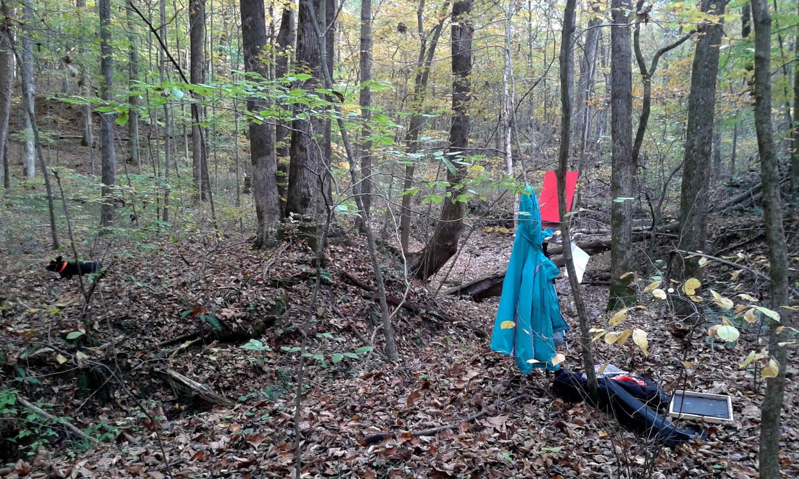
This painting was done on location on a lovely fall day.  The afternoon was clear and sunny but turns chilly as the sun goes down.  This painting was done 4-7 p.m.  I found a nice vantage spot to paint from along my regular two mile trail and set up "camp". 


I tie  my jacket around my waist when hiking out to the site so that I don't get too warm and too sweaty. And end up chilled!
I hang it on a tree until I cool down and need to wear it. Kendra has taken up her position nearby -- you can see her to the left, center -- look for the speck of her orange collar.
I try to aim my easel so there is no direct sun on it.  I really don't like using an umbrella for the sun and avoid using it if I can.
I sketch out the scene, the "lay of the land", with transparent magenta dipped in oil.
I started to "carve" out the land with the paint beginning with the darks of the earth surrounding the creek.
I start to add the lighter background values and sky reflected on the creek.
Kendra is supervising my progress.
This is the end of the painting but the photo doesn't really capture how dark it was getting at this point -- except for the fuzzy photo in the low light. I was walking home in the dark.


"Autumn in the Forest, October 28, 2016", plein air oil on panel, 16" x 12", c. Charlene Marsh

Thanks for checking in!

Happy Trails!

Charlene 

P.S.  I am getting ready for an Art Launch in the next couple of weeks, exclusively for my subscribers, so be sure to sign up for THE ART BRUSH newsletter where you can receive news, tips, special pricing, exhibitions, and more!  As a bonus, when you subscribe, you will immediately receive a FREE one page report on How to Create Health, Wealth, and Harmony Using Fine Art!

Tuesday, November 22, 2016

102516 16x12 Trees Down

This painting was done on location, en plein air, and is a spot along the creek where a couple of large trees have fallen down.  The day was sunny but chilly.  To get the right angle, I had to stand in the creek while I painted.  Walked home in the dark -- luckily, I take a headlight in case I need it but usually my eyes adjust and I don't need to use it.  But, not worth taking a chance-- learned that lesson the hard way in the past.


"Trees Down, October 25, 2016", plein air oil painting, 16" x 12", c. Charlene Marsh

Thanks for popping in!

Happy Trails!

Charlene

P.S.  I am preparing an Art Launch in the next couple of weeks so be sure to sign up for THE ART BRUSH newsletter to get information about new work available for purchase at special pricing exclusive to subscribers.   You will also receive art news, tips about color, decorating, feng shui, exhibitions, and more!  As a bonus, when you subscribe, you will immediately receive a FREE one page report on How to Create Health, Wealth, and Harmony Using Fine Art!

Sunday, November 20, 2016

102416 16x12 Turquoise Water

Another plein air fall painting on a sunny, clear day.  This is a favorite spot along my regular two mile trail.  Temps were mid-50s to 60 degrees and falling as the afternoon turned to evening.  As I was finishing up, I heard a deer cry off to one side and first thought Kendra, my dog, was after it but, instead, she was curled up nearby, albeit ears perked at that moment. Still not sure what upset the deer  -- maybe she realized she was about to encounter a human and dog back in her woods!

I just loved the turquoise color of the water due to the shale rock.  I mixed the shale using cerulean blue and a touch of cadmium yellow light and cadmium red medium. 

"Turquoise Water, October 24, 2016", plein air oil painting, 16" x 12", c. Charlene Marsh.

Thanks for stopping by.  

Happy Trails!

Charlene

P.S.  I am getting ready to launch some new paintings exclusively to my subscribers so be sure to sign up for THE ART BRUSH newsletter where, in addition to receiving info about the new artwork that will be available(at special pricing), you can receive art news, color, decorating, and feng shui tips, news about exhibitions, and more!  As a bonus, when you subscribe, you will immediately receive a FREE one page report on How to Create Health, Wealth, and Harmony Using Fine Art!

Monday, November 14, 2016

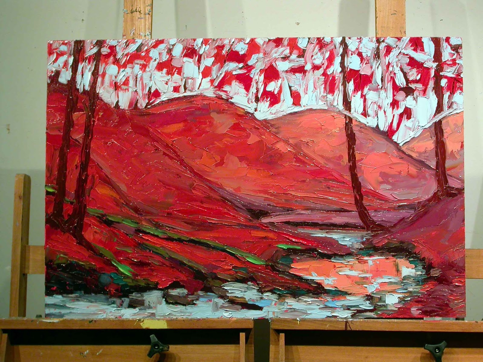
101116 S 24x36 "Autumn Reflections"

With the colors turning quickly now, I wanted to capture the fall in a 24" x 36" painting.  I set up an "inspiration board" with past paintings that you can see on the right side of the picture.  I started with an initial sketch, the "bones" of the painting,  using the Primary Red Magenta which is a transparent color. 

I start to block in the darkest darks of the painting.  I usually start with the darks and work to the lights.  Much easier to lighten a dark than darken a light!
I start to flesh in the "muscles" or "earth" of the painting.  The distance hills are painted in a more muted, cooler tone. 
The hills that are closer are painted with a more brilliant red. 
I have worked to the lighter colors at this point and blocked in the muted orange of the creek reflection, the flowing water of the creek, and the sky.
For both the sky and the creek, I use Cerulean Blue mixed with Titanium White. I finish blocking in the sky adding some highlights to the creek.
I start adding the trees and tree reflections in the creek.
Branches and leaves are added, working over the entire surface.I continue adding details.
Final touches are added to make sure features in the foreground pop forward and background features sit back.  

Here is the finished painting:
"Autumn Reflections", Code #101116 24x36, oil on panel, 24" x 36", by Charlene Marsh.

Thanks for visiting!  

I love to hear from you so please leave a comment or question!

Happy Trails!

Charlene


P.S.  Be sure to sign up for THE ART BRUSH newsletter where you can receive news, tips, special pricing, exhibitions, and more!  As a bonus, when you subscribe, you will immediately receive a FREE one page report on How to Create Health, Wealth, and Harmony Using Fine Art!
 

Thursday, March 31, 2016

032416 24x36 Summer Flowers Next to the Creek

The support for this painting is a 24" x 36" hardboard panel that I have already prepped and tinted with napthol crimson acrylic paint.  The rule is "fat over lean" meaning oil can go over acrylic but not vice versa.  Same rule applies to food, too!  Ha!  Fruit (lean) first followed by fats!  Fruit digests so quickly, that if you eat it after the fat, it will start to ferment in your digestive system and cause problems.
Anyway, back to the painting.  I draw out the initial sketch using a brush dipped in cold pressed linseed oil and magenta and cerulean blue. 
I mix a dark green using Ultramarine Blue, Cadmium Yellow Light, and a bit of Magenta Red or Cadmium Red Medium and start blocking in the background trees.  A dark earth color is mixed with the Ultra Blue and Cadmium Red Medium and used to flesh out the creek bed.
I mix blue greens to recede into the background and mix greens with more yellow and warmer colors to move forward.
I mix a violet with the Magenta and Cerulean or Magenta and Ultra Blue and pick up a little mixed green to dull it down a bit.
I mix a turquoise for the creek as well as some of the Cadmium Red Medium mixed with Cerulean Blue.
I mix a very light sky blue with Cerulean and Titanium White and pop it in along the horizon line where the sky is lightest. 


 The sky is filled in with a mix of Cerulean Blue and Titanium White.

Once I have the "muscles" of the painting in place, I start adding the flowers. 
I use the pure Cadmium Red Medium and Light for the poppies.  A mix of the magenta with a touch of yellow and lot of white are used for the initial hollyhocks.  As the painting progresses, I mix up various hues and values for the hollyhocks.  Some with magenta and white and other mixes have some cerulean or ultra blue added. 

I add the little waterfall to the creek and the ripples on the water.  All the while continuing to add all kinds of flowers to the painting.  


Wildflowers, poppies, lilies, sunflowers, and Queen Anne's Lace are added and worked over the surface. 


And the finished painting, "Summer Flowers Next to the Creek", oil on panel, 24" x 36", #032416 24x36, by Charlene Marsh.

Thanks for following along!

Happy Trails!

Charlene 

P.S. Be sure to sign up for The Art Brush newsletter to see what I share with subscribers!

Friday, March 11, 2016

030416 30x60 PART 2 Poppies, Hollyhocks, and Lilies by the Creek

Okay, this blog will start where I left off, starting the second canvas in this diptych.  Please click HERE for PART 1.   

I had already sketched out the scene when I started the first piece so I was able to dive right into the painting.


This canvas will feature a waterfall so I block in the darks of the rocks around the creek and waterfall and the background trees.  I change the creek so it curves back to the right instead of the left.


Then I start to block in the greens plus some of the violet that will pick up the color of the flowers.  The greens are mixed with cerulean blue and cadmium yellow light.  Plus some have cadmium red light and medium mixed in.  I premix the greens and then premix an orange.  Then I pull a bit of each color from each premixed pile to get a wide range of greens.  I mix small batches at a time and then mix more as soon as it is used up.


I pop in the various shades of greens and violets throughout the painting working the entire canvas at the same time.  I start painting in the poppies, wet into wet, using a circular motion with the palette knives. 


I start fleshing out the tumbling waterfall using cerulean blue and a bit of cadmium yellow and titanium white.  Some of the cadmium red on my palette also mixes into the water colors.  Hollyhocks and broad leaves are added. 


I keep working the entire surface adding more poppies, hollyhocks, broad leaves into the wet paint.


White water is added to the waterfall and ripples added to the pool of water.  Goldfish are flecked into the water and ripples pulled over them.  


This is my palette by the time the painting was completed.  My taboret is an old AV cart I bought at IU Surplus for something like $10.  The cart even has an electric cord and outlets if I ever want to plug it in!  But it is the perfect height to paint standing up and has two shelves for painting supplies like brushes, knives, paper towels, etc.


I took this side shot of the painting to show the thick, heavy, impasto paint on the surface.  Photos on the internet simply fail to convey the energy and richness of the thick paint!  


And here is the final, finished shot of the diptych:

 "Poppies, Hollyhocks, and Lilies by the Creek", oil on canvas, diptych, 30" x 60" overall, each canvas 30" x 30", Code #030416 S 30x60, by Charlene Marsh, c. 2016.

Thanks for following along!

Happy Trails!

Charlene

P.S.  Be sure to sign up for my email newsletter, The Art Brush, to be notified when paintings are made available and receive special pricing.  Subscribers also receive updates about my exhibition schedule, paintings in progress, tools, equipment, supplies, workshops, classes, painting tips, reviews, auctions, and other news.