Wednesday, August 10, 2016

Enchanted Valley

Just finished a new triptych, "Enchanted Valley", I want to share with you.   
This painting has a nice balance of Yin and Yang elements making it a wonderful feature suitable for the bedroom or the family/living room.  The blue water in the painting is both refreshing and rejuvenating while still creating a calm and relaxing environment.  Water symbolizes money and wealth and moving water and waterfalls, in particular, stimulate good fortune.  The fish in the creek symbolically ward off evil and bring good luck.  

Balancing the relaxing, lucky blue waters are the fiery, red poppies that bring an auspicious, active, passionate yang energy to your living space.  Flowers stimulate good fortune and wealth which is enhanced by the invigorating, brilliant, red color.  An eagle represents healing, creativity, and far sighted vision.  This painting will help create a harmonious, lively, happy environment for entertaining family and friends or for intimate moments of quiet and reflection.

This is an oil painting on stretched, wrapped canvas.  The overall finished size is 30" h x 50" w.  Please follow along to see how it was painted.  

I had started a preliminary painting on these canvases that I ended up abandoning.   So I sanded down the old paint and applied the magenta tint back over it.  You can see the shadow of the old painting coming through.  I made a few sketches in my notebook until I found a scene I liked.  

On the canvas, I started with an initial sketch by dipping my brush in cold pressed linseed oil and using alizarin crimson.
Once I start to block in the darks of the creek, the old painting is much less distracting. I mix Cerulean Blue with Cadmium Red Medium and Light to mix the dark shale colors.
 
I add the turquoise of the creek mixing Cerulean Blue and a touch of Cadmium Yellow Light with Titanium White.
A dark green is mixed with Ultramarine Blue, Cadmium Yellow Light, and Cerulean Blue, with a touch of red and used to start to delineate the valleys and shadows of the hills.
The distant, background hills are painted in using a mix of light greens and violets with lots of white so they sit back into the distance.  Brighter greens for the foreground are mixed with Cerulean Blue and Cadmium Yellow Light. 
A variety of greens are mixed with various combos of yellow and blue with violets used to cut down the brightness and create a whole tapestry of rich colors.  I like to keep some green bright so the red and magenta flowers, being complementary colors, visually sparkle against the green.
I added the falls on the creek and the ripples on top of the water.  I am working wet into wet over the entire painting and since blues dry the fastest, I wanted to make sure I got the ripples on the water before the paint dried.
Here, I have started to add the trees and branches and limbs that lace the forest.
Finally, I started adding the flowers.  The red poppies and pink hollyhocks.  I started experimenting with a palette knife that has been in my arsenal for awhile but hasn't really been used.  This palette knife is round and I thought it might be perfect for the poppies -- and I was right!
Here's a picture of the round knife alongside my usual favorite.
 My kitty, Henry, napping by the painting in progress.
 More flowers and leaves and details are added.
I continue working the entire surface adding more details.
I think the valley needs something more -- like an eagle in flight.  I tried painting the eagle first up higher in the sky but ended up bringing him down so he is sailing through the valley with the hills behind him.
Here's a shot of my work space.  You can see past paintings that I print out to create the "inspiration" boards. 
Here's a detail that shows the heavy impasto paint and the red edges.  The final triptych is ready to hang, NO frame needed

As the painting emerged while I worked on it, I was reminded of my favorite book as a child about a young girl who discovered a secret portal in the woods that led to an enchanted land.  I must have read that book a dozen times.  This painting seems to embody that magical place. 
"Enchanted Valley",  oil on wrapped canvas, 30" x 50" triptych, c. 2016, by Charlene Marsh.  Inventory Code #080516 S 30x50. 

Thanks for following along!

Happy Trails!

Charlene 

P.S.  Be sure to sign up for THE ART BRUSH newsletter where you can receive news, tips, special pricing, exhibitions, and more!  As a bonus, when you subscribe, you will immediately receive a FREE one page report on How to Create Health, Wealth, and Harmony Using Fine Art!

Thanks!

Monday, June 27, 2016

062516 Divers

I painted this scene of the deep end of the pool with lots of action on the diving boards!


Another hot, sunny day and lots of people at the pool on this Saturday.  Burned the back of my legs!  Ouch!

Here is the finished painting:


"Divers, June 25, 2016", plein air oil on panel, 12" x 16", by Charlene Marsh.

Have a great summer!

Happy Trails!

Charlene

P.S. Be sure to sign up for my e-newsletter, the Art Brush, and receive instant access to an article I wrote, How to Create Health, Wealth, and Harmony Using Fine Art as well as specials, new paintings, tips, exhibitions, and more! 


P.P.S. I love to hear from you so leave a comment!  Thanks!

061616 Summertime at the Pool

Busy day at the pool!  Hot and sunny!  Lots of action!  This painting was done at the Olympic size pool at the Brown County State Park(Indiana) as part of the Arts in the Park project grant I received celebrating the bicentennial of the state.

I tend to set up and get to painting and things move so fast, I forget to shoot any photos of the progress of the painting.


So here is the painting in situ.  People move a lot so I am often just capturing a gesture, a movement, a head bobble.  


I absolutely love the brilliant sunlight and crystal blue sky and pool but sunburn is one of my greatest challenges!  I wear a long sleeve shirt, hat, and full shoes (tops of feet are very tender!) and often still get burned on some little nook or cranny that the sun finds. 

Here is the finished painting.  "Summertime at the Pool, June 16, 2016", plein air oil, 12" x 12", by Charlene Marsh.


Have a great summer!

Happy Trails!

Charlene

P.S. Be sure to sign up for my e-newsletter, the Art Brush, and receive instant access to an article I wrote, How to Create Health, Wealth, and Harmony Using Fine Art as well as specials, new paintings, tips, exhibitions, and more!

Friday, June 24, 2016

053116 12x12 Fun On the Diving Board

I had such a fantastic time painting the pool, I went back out the next day to paint again.  I arrived shortly after noon and the pool was not quite as bustling as the day before.  But I noticed about the time I was finishing up, there were more and more people arriving.  On my way out of the pool area, I noticed on the signage that the pool doesn't open until noon so I will try to arrive more mid-afternoon to paint and capture the swimmers after more have arrived.  The pool closes at 7 p.m. and I bet the numbers start dwindling by 5-6 p.m.

Anyway, after circumnavigating the pool, I decided most of the action and excitement was in the diving board area so I set up to paint there.  Had a blast capturing the kids flinging themselves off the diving boards in all kinds of acrobatic positions!

Here is the finished painting:
"Fun on the Diving Board, May 31, 2016", plein air oil, 12" x 12", by Charlene Marsh.  

Thanks for tuning in!

Happy Trails!

Charlene  

P.S.  Be sure to sign up for my e-newsletter, The Art Brush, and get instant access to a FREE one page report on How to Create Health, Wealth, and Harmony Using Fine Art!


Thursday, June 23, 2016

053016 12x12 Memorial Day Pool Time!

I headed to the Brown County State Park to paint as part of the Arts in the Park project grant I received.  While I had intended to paint in the forest, I was immediately drawn to the luscious turquoise blue of the pool at the North Entrance of the park.  I also was excited to paint the activity and movement of the people in the pool area enjoying one of the first days of summer.  I used to do a lot of figure painting including quick gestural sketches so I really wanted to try my hand at it again. 

First, I scouted out various vantages around the pool area.  Since the day was quite hot and sunny, I found a spot in the shade to set up in.


Instead of starting with the darkest hues as I normally do, I blocked in the brilliant turquoise of the pool mixed with cerulean blue and white and, to a lesser degree, ultramarine blue and white.  I wanted to capture that crystal clear blue, unmuddied by any other colors or pigments.


I quickly captured a pair of young ladies sitting on the edge of the pool before they got up and left.  The lifeguard was fairly stationary but they changed out about every 10 minutes and the new one would assume a whole new posture.  Throughout the pool area, the people were constantly on the move.  So I would dab in an arm, a leg, a slouch, a dance, a stride that captured the frenetic movement.


This family was heading to their car after an afternoon at the pool and stopped to admire the finished painting.

And here is the final painting.  I took it to a show just three days later, still wet, and the first person that saw it bought it. 
"Memorial Day at the Pool, May 30, 2016", plein air, oil, 12" x 12", by Charlene Marsh.  SOLD

Thanks for following along!

Happy Trails!

Charlene

P.S.   To learn more about my paintings and how they are created, subscribe to my weekly or bi-weekly (or thereabouts) newsletter, The Art Brush. 
Subscribers will be notified when paintings become available and will receive exclusive, special pricing.  The newsletter also has info about paintings in progress, upcoming shows, painting tips, tools, gear, supplies, classes, workshops, reviews, news, and more!
Bonus! When you subscribe, you will immediately receive a FREE one page report on
How to Create Health, Wealth, and Harmony using Fine Art!

Friday, May 27, 2016

051316 S 24x36 Green Grotto

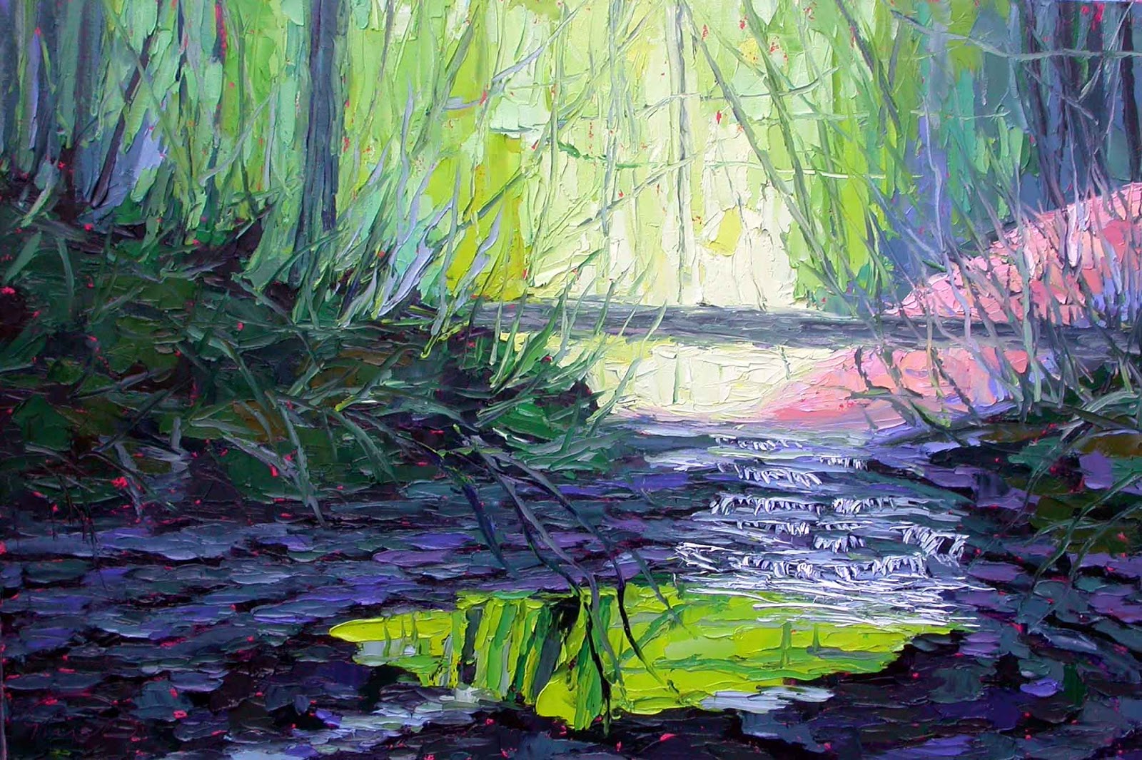
I have done this painting in smaller versions and always wanted to paint it larger.  The painting started as a 12" x 16", plein air piece done on location in the forest but I was dissatisfied with the result.  Months later, I went back into the painting and simplified the shapes and colors and popped in the bright, citrine green that really "made" the painting. 

So for this larger version, I start with a sketch and then jump right into painting with the darks of the shale rock where the creek falls over the soft stone. I mix cerulean blue with cadmium red medium with a touch of cadmium yellow light to get the dark shale color.
Then I start to block in the darker greens of the forest foliage using various combinations of ultramarine blue and cadmium yellow light.
Okay, I'll admit, I got so entranced working on the painting, I forgot to take anymore pictures.  I was also working into the night and have found photos don't turn out too good at night with the artificial lighting.  

But I will tell you that the bright green is mixed using just the right ratio of cerulean blue and cadmium yellow light and titanium white to get that brilliant, eye popping color.  
I wasn't too sure how the painting would work in the larger format but was absolutely thrilled with the result.  The painting really captures in a visceral way the deep and luminous greens of the forest.  

Here is the finished painting, "Green Grotto", 24" x 36", oil on panel, c. 2016, by Charlene Marsh.
 
Thanks for following along!  

Happy Trails!

Charlene Marsh

P.S.  Be sure to sign up for my E-Newsletter for all kinds of special goodies.    As a bonus for signing up, you will get instant access to a FREE, one page report, How to Create Health, Wealth, and Harmony Using Fine Art

Tuesday, May 24, 2016

051616 S 24x36 Gorgeous Flowers

Here's a brand new painting I created for my upcoming shows.

On the right you can see photos of paintings I have painted in the past both "en plein air" and in the studio that I am using for reference and inspiration for this painting.  I made a small pencil sketch in a sketchpad of the basic layout of the painting before I got started.
After drawing the design of the painting on the panel using a brush dipped in cold pressed linseed oil and primary red magenta, I start to block in the darkest darks of the forest and pools.
 
I start to add the middle values of the greens, earth, and flowers.
I continue blocking in the "ground" of the scene.  I add the sky and the sky reflected in the pools.  For the colors close to the horizon line, I mix the sky colors from Titanium White, Cadmium Red Light, and a touch of Cadmium Yellow to indicate a sky changing colors as dusk approaches.  The upper part of the sky is painted using Cerulean Blue and Titatnium White.  Both sky colors are blended for the transition.  Some of the warmer, sunset colors are added to the pools.
I usually like to cover the entire panel with wet paint before I start to go in with the details.  I start popping in the poppies and other flowers in the landscape.
I continue adding flowers and branches and other details working the entire surface, working both the background and the foreground at once.
Leaves and lilies and more details are added.  Sharp edges are softened as needed.
More tweaking and fine tuning.  I often stand back 10-20 feet from the painting to see how it is coming together.  Sometimes I just sit in front of the painting, studying to see what it might need, making a dash of paint here and a dash there. 
And here is the competed painting, "Gorgeous Flowers", oil on panel, 24" x 36", c. 2016, by Charlene Marsh.  SOLD

Thanks for following along! 

Happy Trails!

Charlene 

P.S.  Be sure to sign up for my email newsletter, The Art Brush, to see how the paintings are created, where new work will be exhibited, specials, and other goodies.  As a bonus, you will get instant access to a FREE report, How to Create Health, Wealth, and Harmony Using Fine Art.